Decorating a small space such as a mobile home or studio apartment can be a challenging task, but when done correctly, small spaces can give the illusion that they are much larger. Small spaces can also have many advantages for the home decorator. They are easier to keep clean and are more likely to be decorated very consistently and have a smooth flow throughout. What’s more, it is not necessary to buy as much in the way of furnishings and accessories, so this makes decorating easier on the wallet. Also, you will need to de-clutter frequently because you simply do not have the storage space in a small home. A good rule of thumb is if you haven’t used it in 6 months, toss it.
Walls
Firstly, consider your wall color choices. Light, airy, neutral colors and pale pastels tend to give the feeling of a larger room. Also, painting a horizontal stripe midway down your wall all around the room can create the illusion of a much more lengthy space, but avoid vertical stripes, which have a narrowing effect. Avoid dark colors like black or navy blue, as this creates a claustrophobic feeling by decreasing the depth of space in a room. Paint your ceiling a lighter shade than the rest of the room, or leave it white.
Furniture
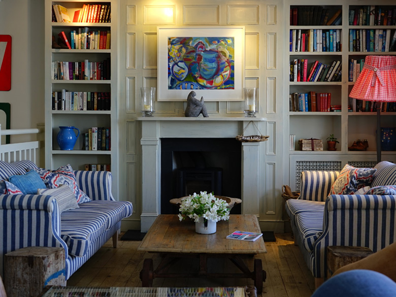
Select small, streamline sofas and chairs with small legs and narrow arms as these will tuck into your small space with more ease. Avoid large three-seater sofas with overstuffed cushions as they simply take up too much space and make it difficult to add accessories without seeming like there is too much in your room. When choosing wooden furniture pieces for your room like coffee tables and bookcases, once again choose thin, narrow designs and perhaps choose a piece with a double function, such as a coffee table that is a trunk for storage purposes or a bookcase with cupboard doors on some shelves to hide items you don’t want on display.
Avoid large accessories. Gigantic paintings above your sofa will seem overwhelming and take up too much space on a small wall. Mirrors and other reflective surfaces give the illusion of more space. Purchase fabrics of small patterns only. Limit busy patterns to small items like throw pillows or a small throw blanket. Use enclosed cabinets and armoires more frequently than bookcases cluttered with many items: the cupboard doors can conceal a mess that you never get around to organizing. Select only your favorite items for display in the room.
Bedrooms
In the bedroom, keep framed pictures to a minimum and select small vases or jewelry boxes for your dresser top. Purchase storage bins and hide them under the bed for extra storage purposes. Add a closet organizer to keep things up off the floor and neatly arranged. Again, avoid the tendency to clutter you space with knick knacks. This can sometimes be acceptable in a larger area, but the smaller the area, the more easily cluttered it becomes. Instead of bedside tables, opt for small bookcases mounted on the wall on either side of the bed. This frees up much needed floor space. If space allows, consider moving your dresser inside the closet, again freeing up floor space. Hang a mesh laundry bag on the back of your closet door.
Bathroom
Make good use of your bathroom medicine cabinet and the cupboard space under the sink. In a small bathroom avoid leaving a surplus of products on the counter top, which again will contribute to a much cluttered feel.
Windows
Window treatments should be streamline and petite as well. Avoid floor length drapes. If your curtain choice covers the window, try to keep the curtains open as much as possible to shed some light on the room, as spaces tend to look larger in natural daylight. Place your furniture in such a way that shadows are eliminated or at least minimized, as shadows tend to give the illusion of the room being cut up into smaller pieces. Avoid ceiling lights as this gives the impression of a lowered ceiling.
Be sure to maximize the use of the many nooks and crannies a kitchen tends to offer. For example, use the space above the cupboards to showcase special dinnerware or wine glasses. Hang pots from a rack suspended from the ceiling as a means of freeing up cupboard space.
Decorating on a Budget
Finances tight? Need to stick to a budget? What many people in this situation don’t realize is that you don’t have to sacrifice style when you are low on cash. There are many ways to jazz up pieces of old furniture found at thrift stores and countless do-it-yourself patterns found on the Internet these days for curtains, table cloths, and just about anything else you are looking to make from cheap scraps of material. Following are a few simple ideas to stretch that dollar and have your living space looking like a home decorating magazine centerfold.
One key point to remember is that when it comes to home decorating, more is less, which is always good news to those looking to scrimp on accessories and save cash. Keep knick-knacks limited to a few favorite pieces in each room. Clutter makes rooms look small and junky, and today’s look is minimalist.
Want to make changes but don’t have the money to do a total revamp?
1) Consider changing the paint color on the walls only. A fresh, clean splash of color tends to make old furniture pieces and accessories look brand new. Purchase “mistinted” paint that was originally mixed for another consumer but didn’t suit their preference. This is significantly cheaper than choosing your own color from a paint swatch and having it mixed. Savings can be upwards of $20 per gallon for mistinted paint. Shop around to different hardware stores and you are bound to find a mistint that you like. Opt for painting wooden furniture pieces as well. Slap a quick coat of color on furniture of your own that needs a facelift, or shop for old pieces at thrift stores or auction houses and strip and refinish at home.
2) As a cost effective alternative to thrift store shopping, many cities have organizations known as furniture banks. You can arrange to drop off old pieces of your own furniture that you no longer need or have the desire to keep, and select something from the bank to take home in place of the donated piece.
3) Make it yourself. Do you have a sewing machine or a friend who is willing to let you borrow one? Purchase fabrics from the discount bin at your local sewing shop and learn to make, for example, curtains, bed skirts, pillowcases, and quilts. The options are limitless and a set consisting of a valance and two tiers would cost a little over $2, at a price of $0.99 a meter. If you are making over your kitchen and want to center your design around your new curtain set, reupholster cloth-covered dining room chairs using the same fabric or a coordinating pattern. All that is needed for this project is a staple gun and scissors. The same can be done for lampshades. Can’t sew? Don’t worry. Fabric shops sell something called fabric tape where you can literally stick your pieces together for a very similar look, without all the fuss of a needle and thread.
4) Purchasing new furniture and needing to save money in doing so? Buy furniture pieces that have multiple functions. For instance, a coffee table that doubles as a trunk with storage space or a sofa that pulls out into a bed.
5) Purchase unfinished wooden frames at lumber stores and stain in a shade of your choice. Instead of paintings and other art pieces, opt for simple, favorite photographs of friends and family. The cost of developing digital photographs is about $0.19/image. Decorate with houseplants. Get plant clippings from a family member and grow your own garden by starting in small pots and eventually moving to large hanging baskets.
6) Use what you already own. Opt for a free redecorating strategy, and that is, simply rearrange your furniture. This can give a room a whole new look without spending a cent. Or swap furniture with pieces from other rooms to bring a bit of “new” into your space.
Tips for De-cluttering a Mobile Home
It isn’t always necessary to purchase that bigger home when you start feeling like you are running out of room or like your home isn’t growing with your family. Perhaps what you need is a one good weekend devoted to a de-cluttering overhaul of your entire house.
- Toss anything you don’t use. Simple as that. Don’t wear it? Toss it. Broken toys? Toss. Board games missing pieces, ripped books, video tapes that no longer work? Toss ’em. If you find you have emotional attachments to belongings you simply cannot bear to part with, read on and you will quickly discover ways to maximize your storage space to house all of your prized possessions.
- Everything you own should have a place. When it gets removed from it’s place, be sure to put it back as soon as possible before it gets lost in the shuffle once again. a good rule of thumb is limit how many times you move something. Did you take the car keys out of your purse and toss them onto the kitchen counter? Either leave them where they are or put them back in your purse; don’t move to a third destination. But remember, because everything needs a place, doesn’t mean that every place needs a thing. Be sure to leave some open spaces on bookcases, in cabinets and armoires, and in kitchen and bathroom cupboards. This frees up space for new belongings that you purchase or for those things that just never really seem to belong to a place. Everyone needs a few good junk drawers.
- Examine your room left and right, high and low for optimal storage spaces. Areas that people tend to forget, for example, are the tops of kitchen cupboards, under beds, beneath the basement staircase, and the top shelf of coat closets. Maximize the use of these spaces by hiding things you do not frequently use here.
- Simply create more storage space. Add affordable shelving to living room walls, add a bulletin board in the kitchen for important papers, and add an over the toilet wall cabinet in the bathroom for extra personal care accessories.
- Create a reading corner by putting a small bookcase against one wall and filling it with as many books as you can fit. This minimizes the tendency to have such items scattered around the house, some in each room. Keep like items centralized in one common area.
- Select furnishings that are multi-purpose, such as a footstool that acts as a coffee table.
- In high-traffic areas of your home, have one forgiving area where you can toss clutter, and organize it once a week by putting things back where they belong. Baskets function well in these areas, as do large food storage containers.
- When you bring something new into the home, toss out one item in its place. That way you never allow yourself the accumulation of too many belongings. Consider donating such items to charity, and give another family something they need.
Color Choice and it’s Effects on Mood
Often when redecorating a room in our houses, the first thing we think of is does the new paint color match the existing furniture, or are we choosing a paint color that gives the illusion of a spacious room. However, there is one very important aspect to take into consideration when deciding what colors to base a new room design around, and that is, how the colors ultimately affect your mood. After all, you have to be surrounded in it each day, might as well choose a shade that gives enhances the appropriate mood for the room in question.
Firstly, it is essential to note that certain palettes work better in certain rooms; for example, warm tones tend to work well where you will be engaging in inviting conversation and interacting with others, such as a family room or a dining room where you gather with friends and family for special dinners. This is because most often warm colors aid in exciting the senses. Warm colors include red, yellow, and orange, for example. The kitchen is often the location where a heightened level of socialization occurs as we share in the joy of preparing food with loved ones, so you want to aim for a bright, lively shade in this area such as yellow. On the contrary, cool tones such as blue, green and purple work best in areas where you wish to relax, such as the bedroom, bathroom, or home office. Cool tones are known for their relaxing effects.
Following is a guide to paint color selections based on how color affects your personality and overall mood.
- Yellow: rejuvenating, energizing
- Red: stimulating to the senses, arousing
- Blue: calming, relaxing
- Green: Stabilizing
- Orange: cheery, social
- Purple: comforting, safe
Red, yellow and orange are known as primary colors, whereas green, purple and blue are known as secondary. It is hard to find a good balance with these colors where mood is concerned, so when selecting a shade it is most often best to choose a tertiary color, which is a combination of one primary and one secondary. For example, red and purple yield pink, and this creates a fair mix of the red and purple moods, resulting in an exciting, yet comforting environment.